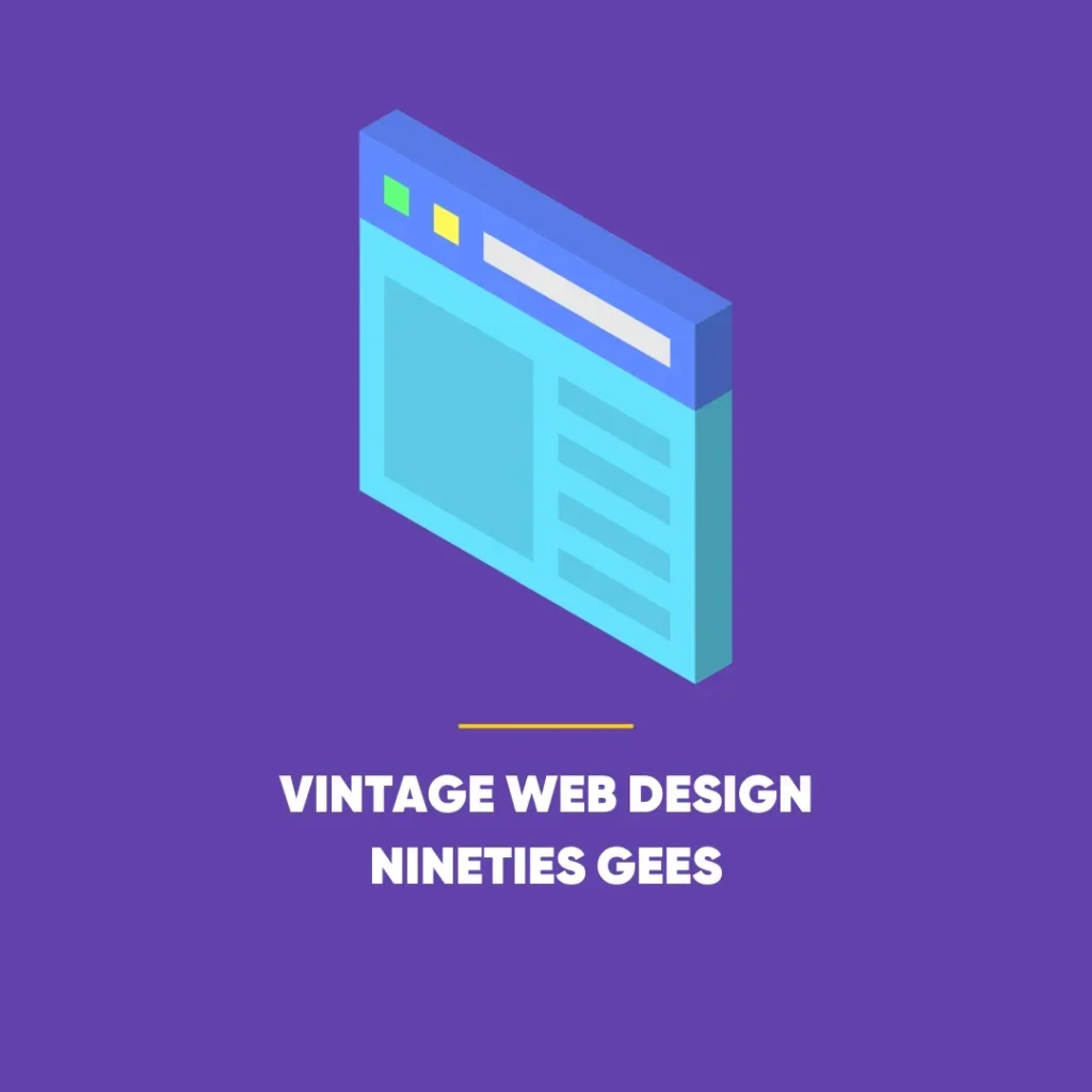

UX Design Systems: The Broken Promise
UX design systems promised a revolution, yet they often stifle creativity instead of enabling true scalable consistency. We were sold a Silicon Valley dream of perfect consistency at scale, where teams could collaborate effortlessly across Johannesburg, Cape Town, and remote home offices. It was supposed to be the “silver bullet” for efficiency. However, that dream has slowly morphed into a nightmare of “design by spreadsheet.”
We now face a stark reality where design systems function less like creative enablers and more like rigid corporate control mechanisms. In our pursuit of structure, we are smothering the very soul of South African design – which has always been about ingenuity and vibrancy. It is time to examine the uncomfortable truth: our obsession with systems is killing our creativity.
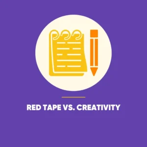
The Bureaucracy of UX Design Systems
Ideally, a design system should be like a well-paved highway: it gets you to your destination faster. Unfortunately, in many local corporations and agencies, it has become a roadblock. Design systems have turned into strict compliance tools, wrapped in the glossy language of “efficiency” but wielded like a weapon of control.
 Designers are no longer fighting for the user; they are fighting the constraints of the .fig file. Instead of creating innovative work that solves unique local problems – like data constraints or diverse language needs – designers live in fear of deviating from established components. Breaking the “rules” is treated like a cardinal sin.
- The Checkbox Culture: The design process has deteriorated into a purely administrative task. It feels less like creative problem-solving and more like standing in a queue at Home Affairs – filling out forms just to stay compliant.
- Misplaced Priorities: Discussions rarely focus on the impact on the user. Instead, we spend hours debating token specifications or arguing whether a specific hue violates a strict code.
The system has begun to serve itself rather than the people. Figma created an illusion that centralisation equals clarity. In reality, it breeds a stagnation that feels all too familiar in corporate structures.
When Tokens Replace Taste
In the beginning, design tokens seemed like magic. You define your colours and typography once, and voila – everything updates automatically. It promised a unified language between the design team and the developers.
However, practice reveals a different story. Design tokens have become endless layers of abstraction. They multiply faster than the problems they solve. You start with ten tokens, and before you can say “now now,” you are managing hundreds.
The result is a loss of meaning:
- Cryptic Naming: Confusing naming conventions leave teams scratching their heads.
- Loss of “Gees”: We lose the human meaning behind a colour choice. We forget why a specific spacing feels “lekker” and intuitive.
Ultimately, this represents a failure of philosophy rather than engineering. We have effectively replaced intuition with the illusion of mathematical rigour. In essence, we have turned art into algebra, stripping away the vibrancy that makes design connect with humans.
The “Same-Same” Trap in UX Design Systems
Figma made componentisation incredibly easy. You drag, drop, and nest elements with zero friction. Nevertheless, a major problem exists: Context does not scale.
Components know how they look, but they do not know why they exist. A button in a high-stress banking transaction serves a very different emotional need than a button on a playful marketing landing page. Yet, our systems enforce a rigid sameness. They mistake aesthetic consistency for functional clarity.
This leads to a User Experience (UX) “uncanny valley.” Everything looks consistent, yet it feels disconnected and sterile. The product lacks rhythm, warmth, and that distinct personality that separates great local brands from generic templates. Good systems should teach us when to break the rules to serve the context. Figma rewards compliance instead. As a result, designers think less and manage more.
Collaboration or Committee?
Multiplayer collaboration stands as Figma’s biggest triumph, yet rigid UX design systems often stifle our creative potential. Yet, it also poses a dangerous threat. It creates a false sense of alignment. Just because multiple designers are hovering in the same file doesn’t mean they are working together effectively. Often, it is just collective micromanagement.
Everyone sees every move. Consequently, design becomes a performance. Teams over-document their decisions to cover their tracks. They add layers of approval that would make a government department blush. They fear misunderstanding, so they play it safe.
The craft of design turns into “design by committee.” We polish innovation until it becomes bland. Figma’s openness amplifies this human psychology, flattening strong opinions until only consensus remains. We produce work that is safe, predictable, and ultimately forgettable.
The Myth of Scalability
 Figma pitches design systems on scalability. But here is the hard truth: most South African teams do not need to scale like Uber or Google. Most teams are building one or two core products. Yet, we spend months building infrastructure designed for global complexity.
Figma’s business model shapes this culture. The company thrives when organisations standardise, as every new library justifies more enterprise plans. This forms a trap for designers. Teams spend months refining the system instead of the product. The user sees absolutely no benefit from your perfectly organised variants. We mistake this “busy work” for productivity. In the end, the system becomes the product, and the actual product suffers.
The Rise of Bloated UX Design Systems
Years ago, we fought against inconsistency. Today, we fight design bloat. Modern Figma files contain thousands of components, becoming heavy and slow – much like the legacy systems we try to replace.
These tools should simplify design. Instead, they create “complexity debt.” You open a file and enter a maze of frames inside frames. Efficiency becomes a mirage. We spend more time managing the library than making design choices.
Reclaiming Design Judgement
The biggest casualty in this war of systems is judgement. When designers prioritise strict adherence to complex Figma libraries, they stop exercising taste. We codify every decision into tokens, and therefore, designers stop asking, “Does this feel right?” We only ask, “Does this follow the system?”
Good design emerges from tension. It comes from “maak ‘n plan” thinking – pushing boundaries to solve a problem. Rigid systems punish this deviation. The culture shifts from exploration to maintenance.
We must rethink our philosophy:
- Make systems adaptive, not absolute.
- Encourage rule-breaking when it serves the user.
- Simplify token management – stop over-engineering.
- Bring emotion back.
Design systems should liberate us. They should amplify our taste, not replace it. Tools must honour human intuition. Figma cannot systematise judgement. We must reclaim that power for ourselves.